
The Prisoner’s Apothecary
The Prisoner’s Apothecary is an artist-made social activist project by Jackie Sumell, creator of the Solitary Gardens. The Prisoner’s Apothecary aims to use plants grown in the Solitary Gardens and use them as plant medicine for communities most impacted by the criminal justice system — people who may need alternative care, be interested in herbal medicine, but may not have access, coverage, or the means to pay for alternative care.

Problem
The Prisoner’s Apothecary is an arts project started by Jackie Sumell, artist activist for criminal justice and abolition. The apothecary offers holistic medicine-making workshops across the country using herbs and plants grown in gardens from Jackie’s previous project, The Solitary Gardens, where plants and herbs are grown and tended according to the wishes of folks in prisons through letter-writing. Using plants grown in the gardens, the Apothecary offers the incarcerated opportunities to give back to the communities they are often accused of harming.
Through holistic health and herbal medicine workshops, The apothecary brings important alternative health skills to people that don’t want to rely on Western Medicine doctors for healthcare.
These workshops would also serve as event marketing for restorative justice, offering a bridge between young female college students drawn to apothecaries and plant medicine, but might not know much about the criminal justice system, and families and friends of incarcerated folks, both of which share in common a lifestyle of high stressed, nearing burnout, and in need of holistic healing skills for rejuvenation of mind, body, and spirit.
The task? We needed to create a visual identity for the project which could unite both perspectives under the banner of healing — one which could be used on the website, to promote events, and inform future designs for the apothecary, like tincture and tea blend labels, and on social media. The identity would help her secure grant funding and to promote awareness to move the project forward.
Here’s Jackie talking about this in her Kickstarter campaign.
Process
The brand would marry apothecary with prison.
It would need to reflect some grit while also capturing some of the divine feminine and the sacredness of women engaging in self-care, coming together, being together, healing together, creating and making.
As Jackie and her project were firmly rooted in New Orleans and Southern culture, I began by researching New Orleans’ design and aesthetic, abolition posters, Southern propaganda and abolitionism, exploring colors, designs, signs, and culture. I dug into The Solitary Gardens’ current look and feel to get a sense of the mood of her current work. I then looked into visual cues that could bring the idea of “apothecary” together with “prison” - two vastly different worlds.
After some initial sketches for a logo design, I realized color would play an important role. In my first designs, the iconic orange jumpsuit color and gritty “prison” feel were strongly featured, but I found that this cliche was too strong. So I mentally went back to my conversation with Jackie again for guidance. I was reminded of Jackie’s comment on an element of spiritual healing and sacredness to these workshops and revisited the Solitary Gardens for inspiration.
I came to the conclusion that the initial design I’d created was not feminine enough to tie back to that sacred energy of women making medicine and healing together — something that stuck out to me as important in my initial conversation with Jackie. When I replayed our conversation in my mind and revisited Solitary Gardens, I was reminded of the sense of gentleness to her approach, and the welcoming, heart-centered feel of the workshops and the gardens.
In later versions, I brought in a pastel pink, and a deep green which would loosely relate to the Solitary Gardens while remaining masculine, and things finally started clicking into place.
It was through this trial and error that I discovered it was important push and pull until striking the right balance between the feminine of “apothecary” — vintage, healing, somewhat feminine and trendy, and “prison” — the hard-edged masculine, the energy of battling, burnout, and the grit of the prison system. I came to know that “prison” needed to be barely there, just suggested in the background without hitting you over the head.
Solution

Branded Truck
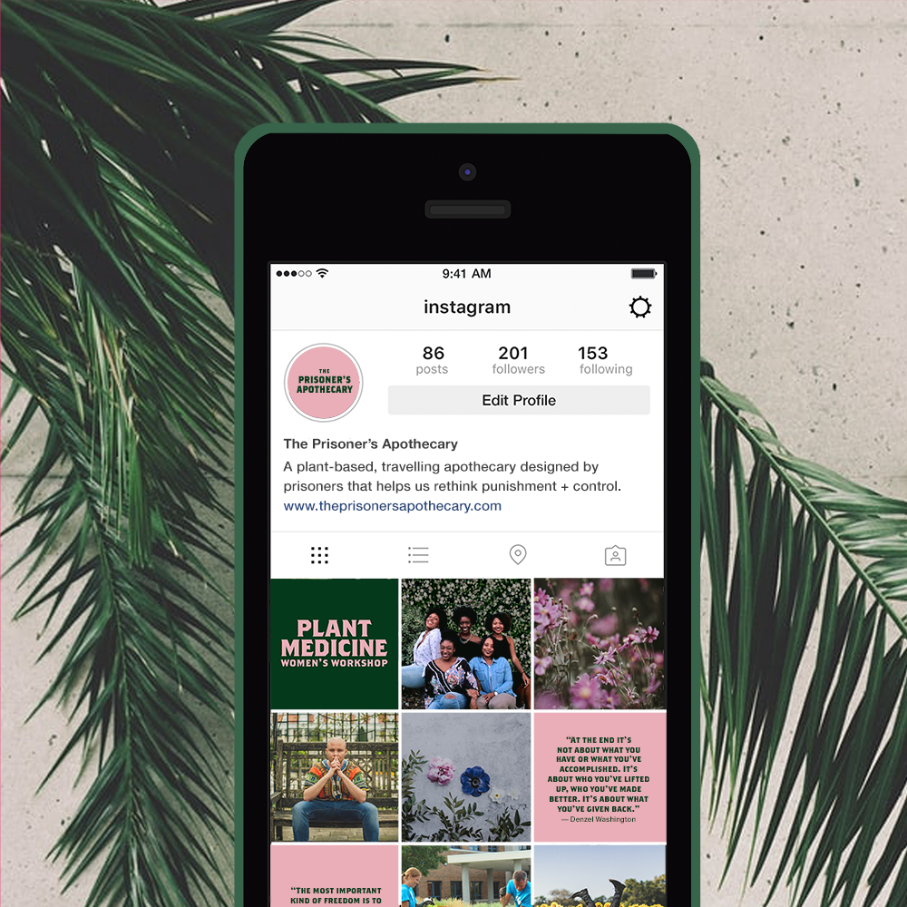
Instagram Branding

Branded Herbal Tea Packaging
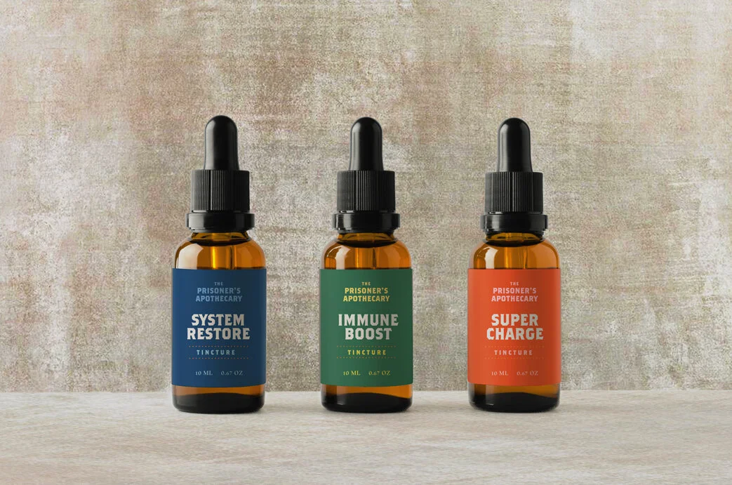
Branded Herbal Tinctures
Event Graphics
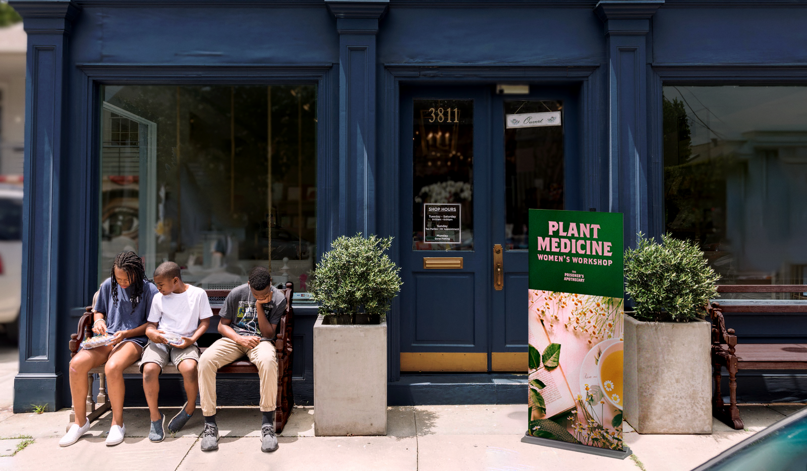
Event Signage

Event Promotion on Facebook
Brand Book
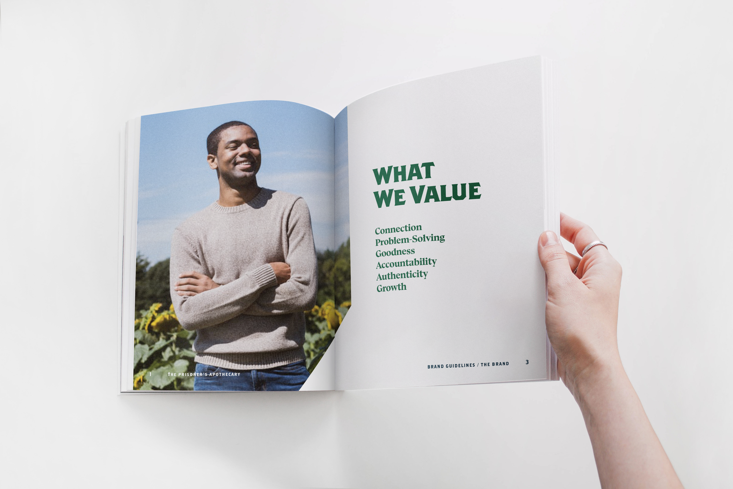
Official Brand Book
What I Learned
As a student project for a real project, I learned about my own limitations and how useful it can be to get outside input from people from different backgrounds and perspectives to protect myself and those I aim to serve from any unconscious biases or blind spots. For example, throughout the project, I faced the challenge of wondering who to represent, what is appropriate to the community being built, and who is the intended audience? While I didn’t have an opportunity to have these conversations during the design of this project, it is something that I thought about a lot and would build into the next project dealing with issues which are outside my own lived experiences to be sensitive to diversity and biases. It taught me the importance of having a diverse team of people working on a project, or at the very least, someone who you can connect with to give your work a look throughout the design process and help guide tone, mood and personality to be representative of the right perspective.