
Wildflower Kombucha
In a Packaging class, I was assigned a photo to design a customer persona around, and tasked to design a health drink to appeal to her.
Persona
Enter Claire, a festival-going, outgoing hipster of Austin, Texas who loves bright colors, parties and was an ex-whisky drinker turned to a high-vibe, vegan, health conscious sort of lifestyle, Claire was definitely a kombucha drinker.
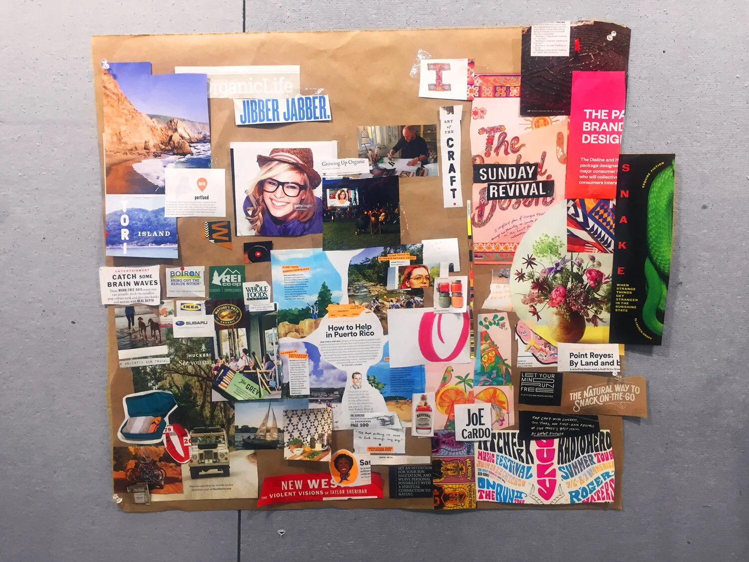
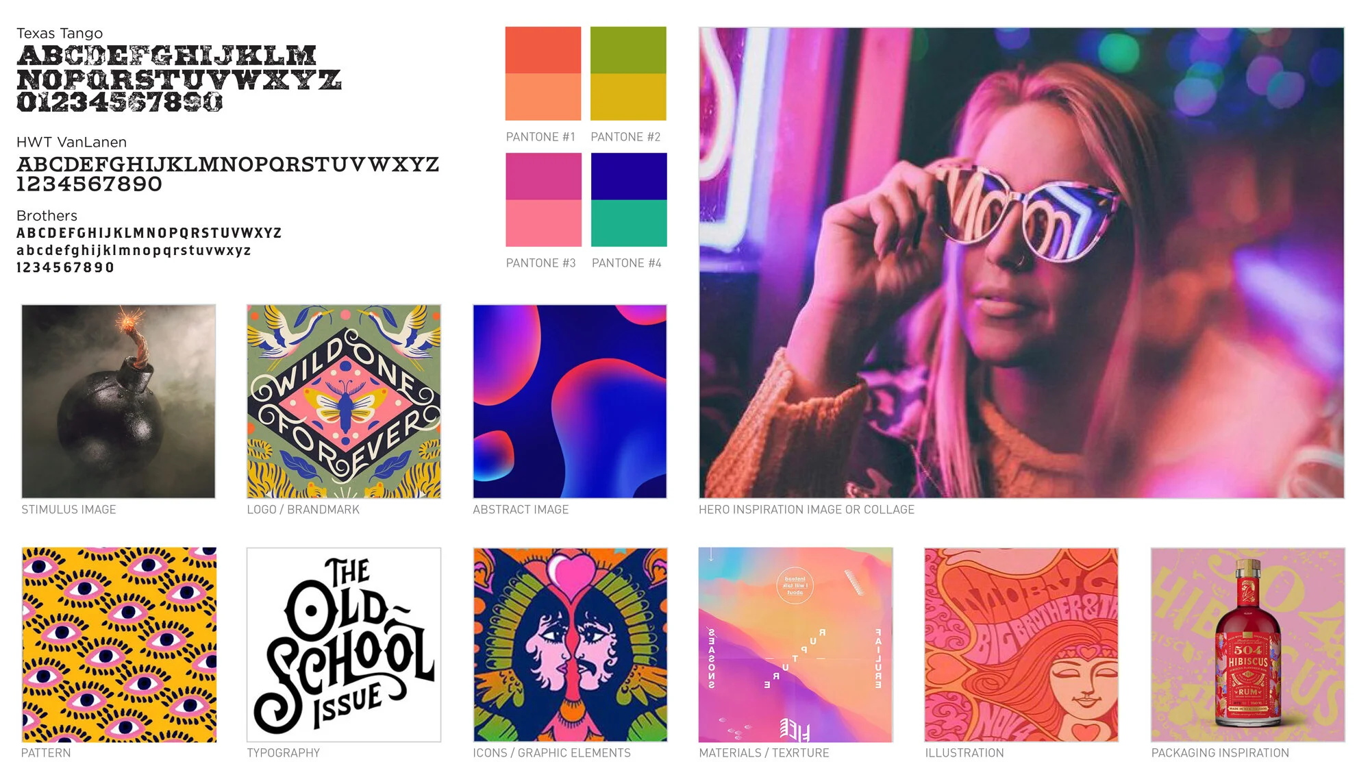
Designing Claire’s persona using collage
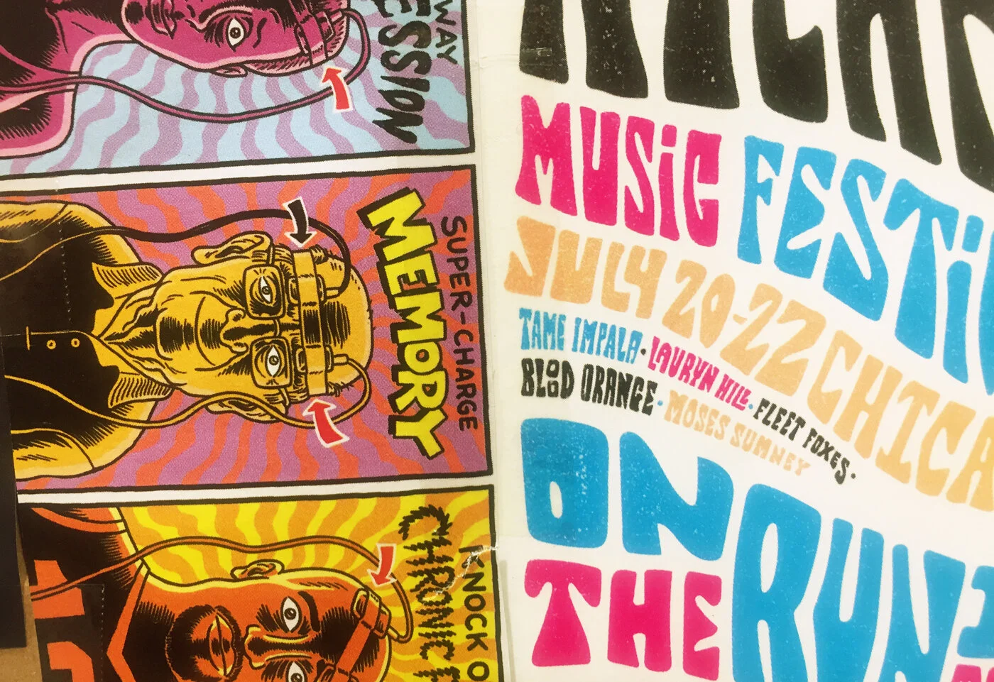
Some psychedelic graphic inspiration to suit Claire’s retro vibe
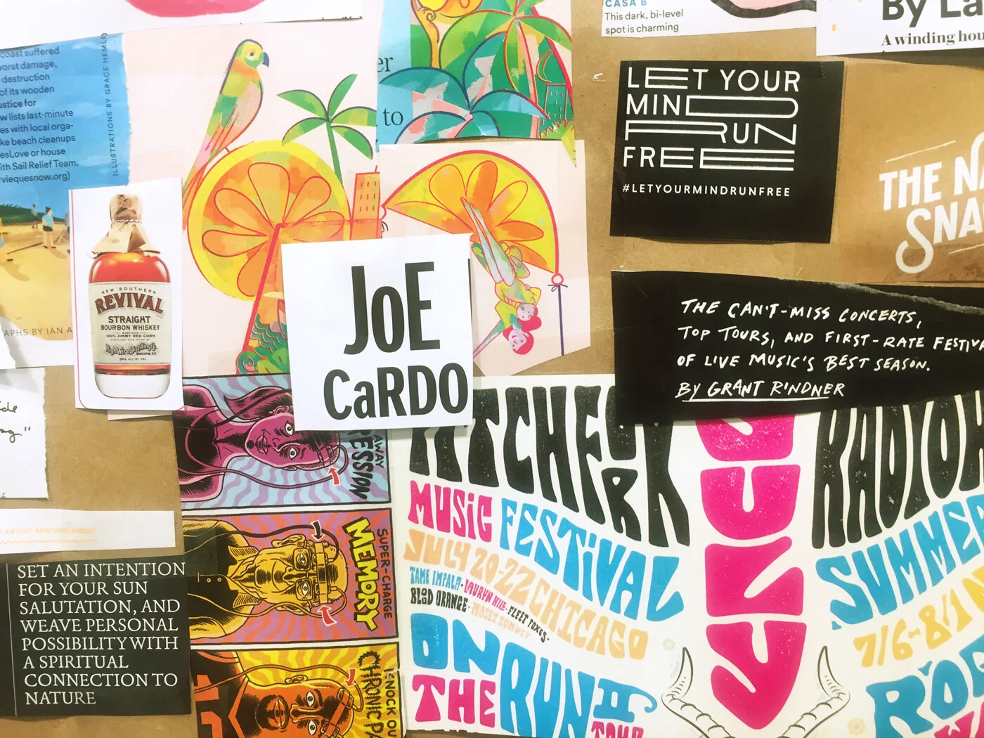
Concepts from different elements of the board would be used in concepting and exploring later in design
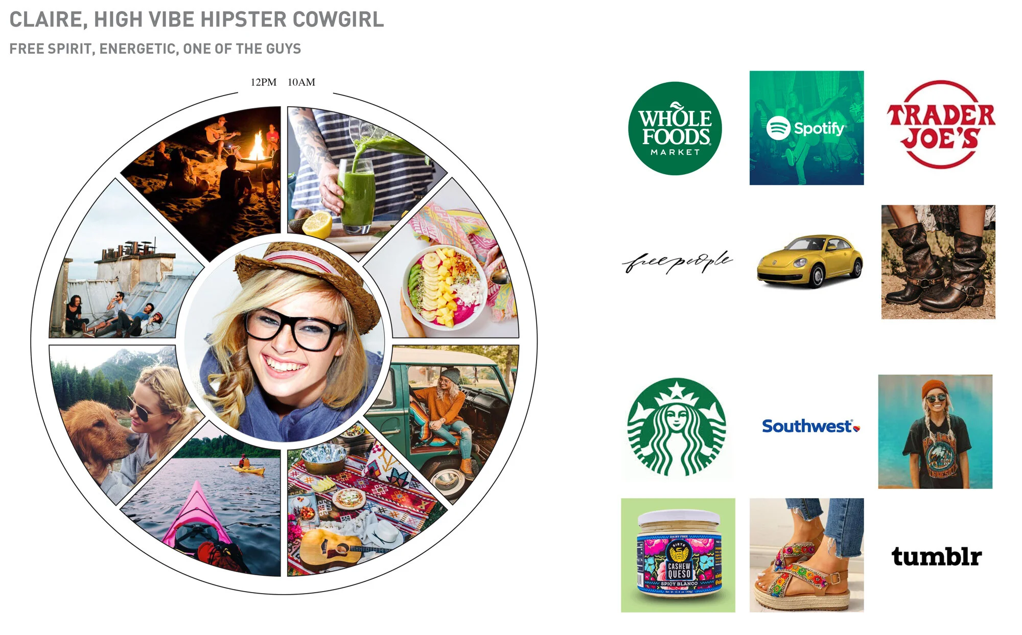
Customer persona mapping for Claire — getting a better sense of who she is, what a typical day might be like, her favorite brands, places to shop, and things which she might feel are important to her identity. Based on this information, I settled on a Kombucha health drink to design for, and got started concepting the packaging.
Concept Board
Concept board took inspiration from elements of the mood board, inspired by her festival-going, psychedelic, hippie style. Initial concepting included heavy old school typography.
Category Research
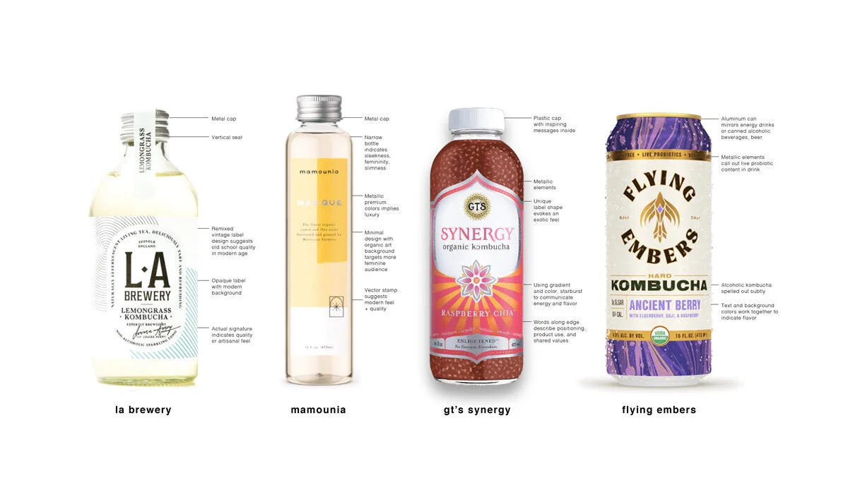
I did an initial packaging audit in the Kombucha category to see what else existed in the space and how I might define a niche for this product.
Iteration
Some early concept ideas in the very beginning stages of design.
A quick early mockup to test an idea, stock background and all. While the typography was fun to play with, this design felt a little flat, lacking complexity or depth.
I took the gradient and basic structure and fleshed out the design a little further.
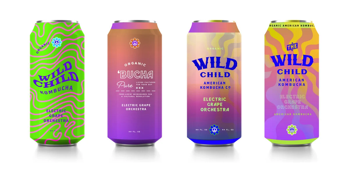
Concept Development
I developed three flavor variations to explore the concept further using what worked, and refining what didn’t work. The typography colors are type treatment were bugging me the most, so I returned to Claire’s mood board and pulled inspiration from the “Joe Cardo” snippet. This is what happened:
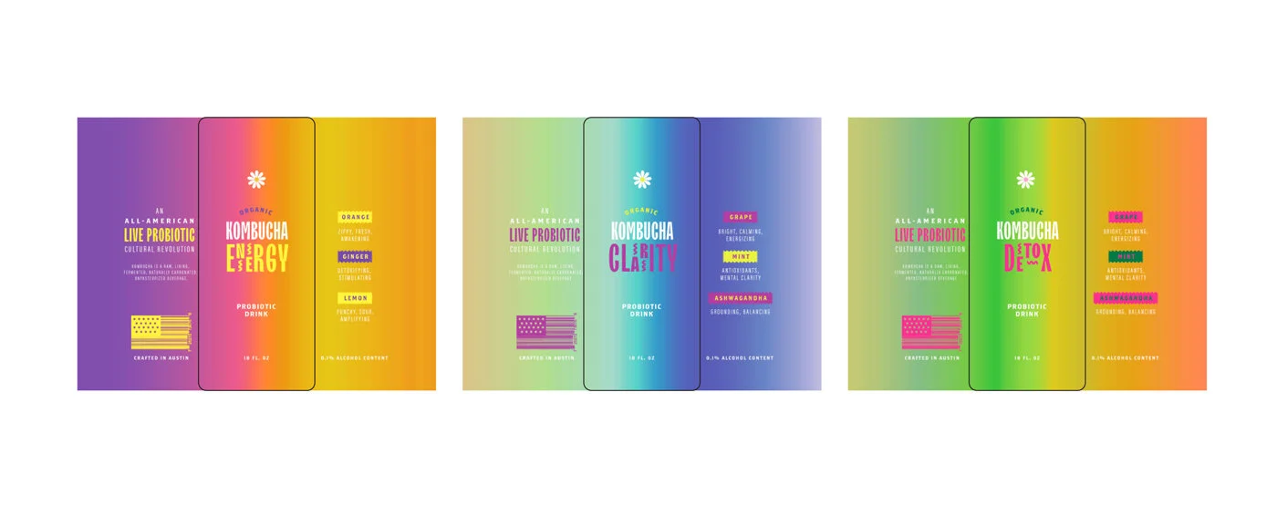
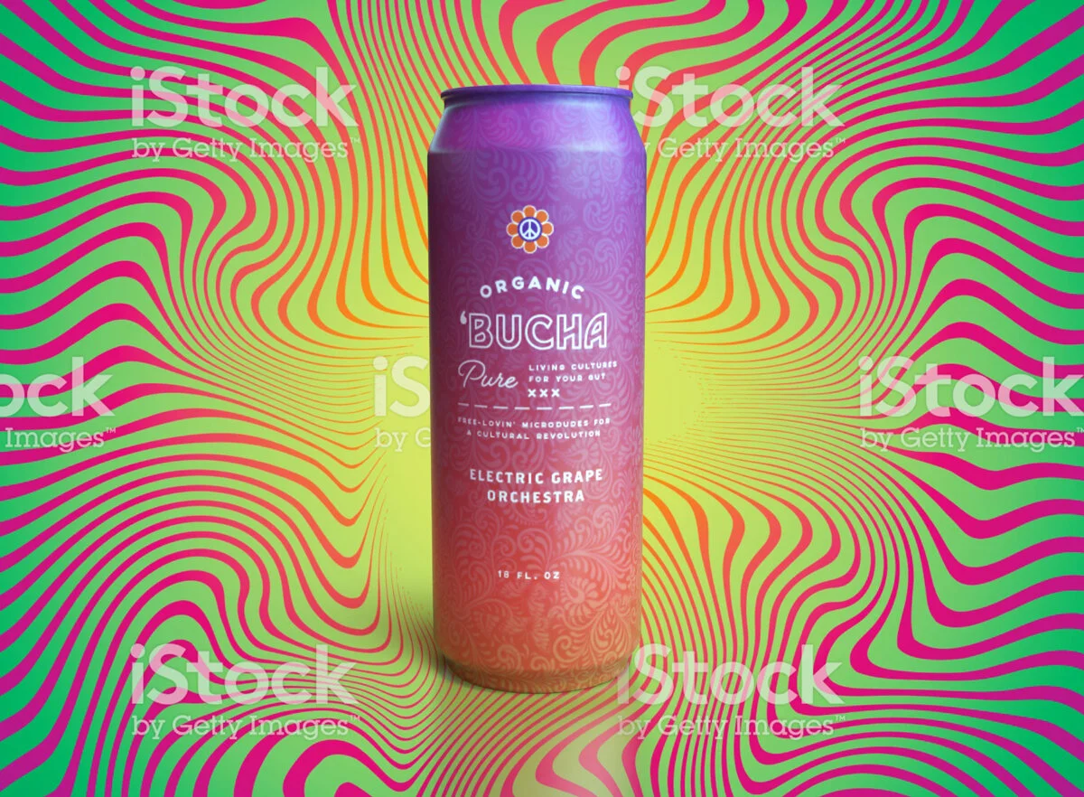
I tested the designs on cans in Dimension, but they still felt too flat.
As I considered Claire and the lost vintage vibe from the initial concept as well as her health preferences (aluminum cans + acidic kombucha = heavy metal leaching), it became clear that this design would work better both for the customer and design-wise in a vintage bottle style — Claire would totally be into kombucha in glass, not a can. I had been using cans as part of the project requirements for class. To round out the project, after the class ended, I ditched the cans and redid the final design in glass. Things finally started to feel complete.
Solution
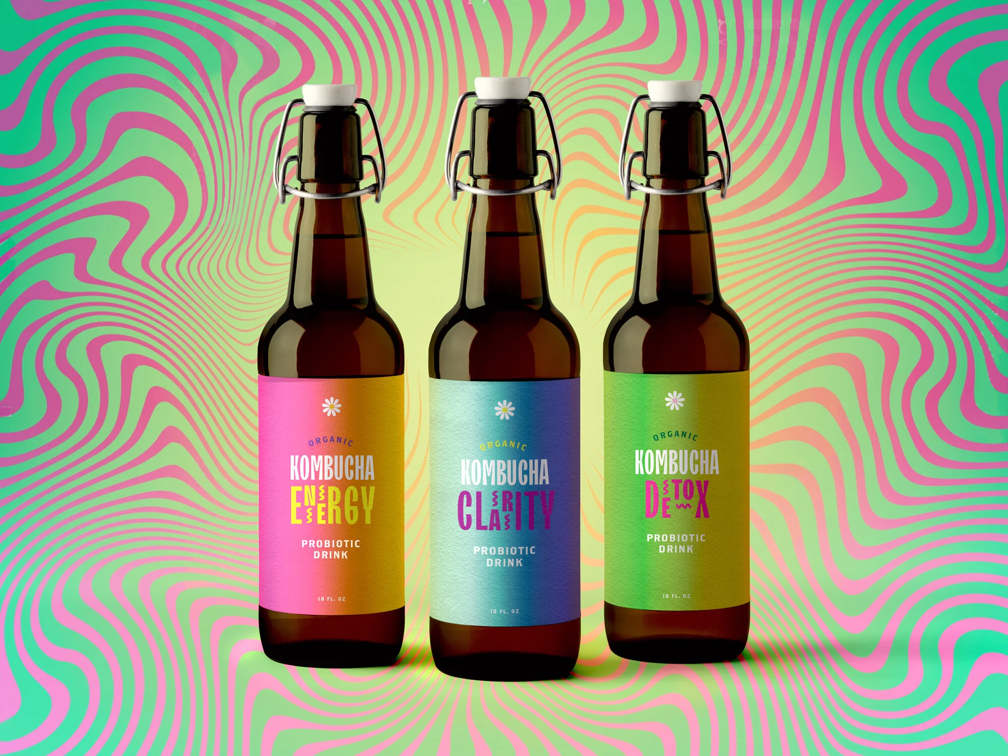
Final design
What I Learned
I thrived in this strategic kind of work, with planning upfront and really digging into the user’s life, visualizing their lifestyle and likes and dislikes, and then designing something completely around that. I found it made me much more creative and allowed me to make design decisions which were more aligned. I loved this process so much that I have begun integrating this kind of process into many other student projects which didn’t have such frameworks built in.