Amitabul Restaurant Identity

Bill began his career as a steakhouse worker and a buddhist temple chef. He started his own business called Amitabul, a spiritual vegan cuisine inspired by his curious mixed background, focusing on all things handmade.
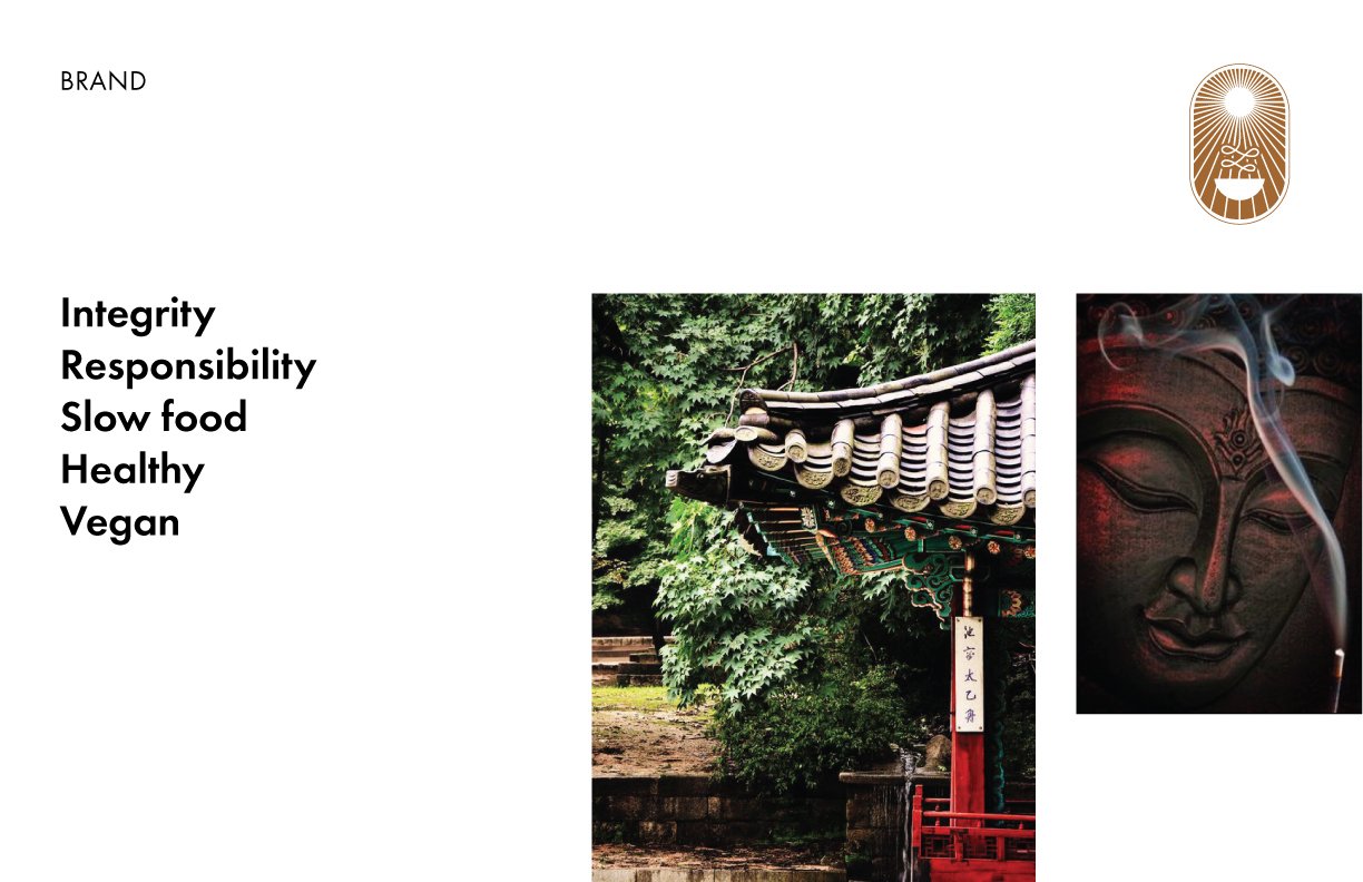
After doing some research into Amitabul’s history and what makes them unique, I came to define them as a company that values integrity, responsibility, slow food, that makes healthy vegan food. I decided to take these values forward into the rebrand to build something that brought the honor of something that felt Eastern, as well as something that felt as bold as a steakhouse might feel, in a vegan food space.
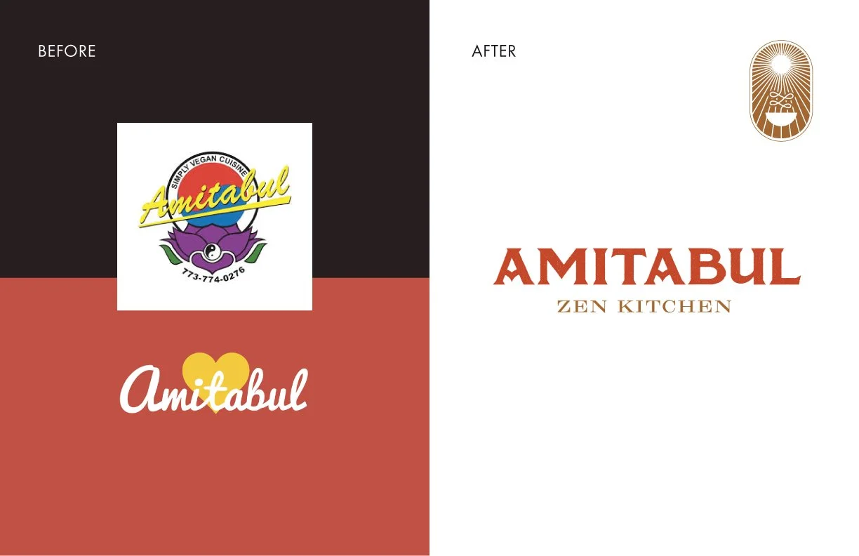
Amitabul had inconsistent branding, with one logo on the storefront and another logo on its menu and website. I felt rebranding them would bring more consistency.
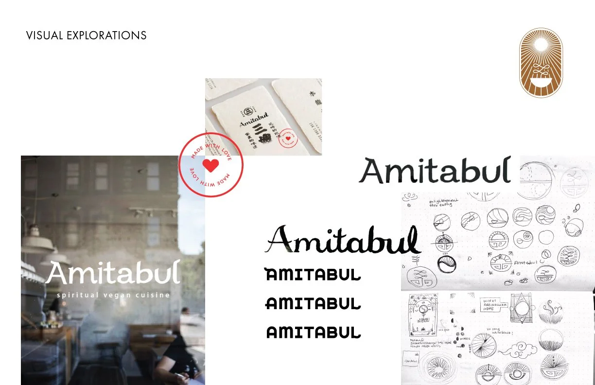
I went through many different hand-drawn iterations and explorations.
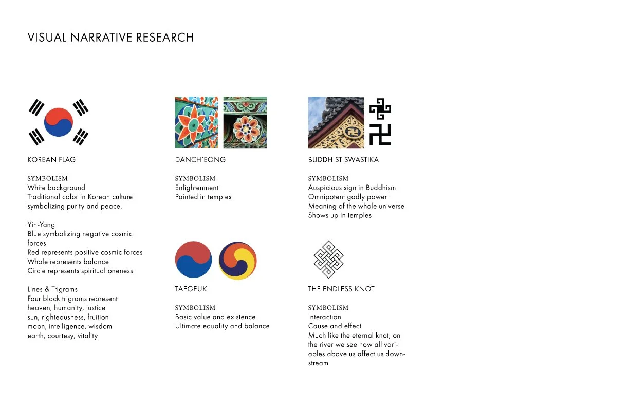
While researching visual narrative ideas, I came across a few different symbols that seemed to symbolize what I was looking for— the korean flag’s lines were interesting to me, the flower of the Danch’eong symbolized enlightenment, the buddhist swastika frequently showed up in temples like the one Bill used to work in and symbolized a universal power, and the taegeuk symbolized equality and balance. I felt these were strong symbols to bring into the brand considering the background and history of this brand.
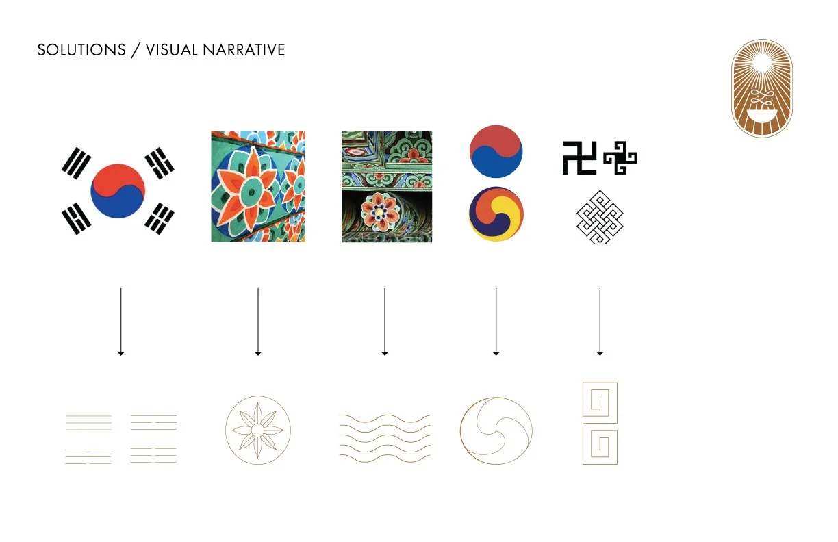
I simplified these symbols into a visual language.
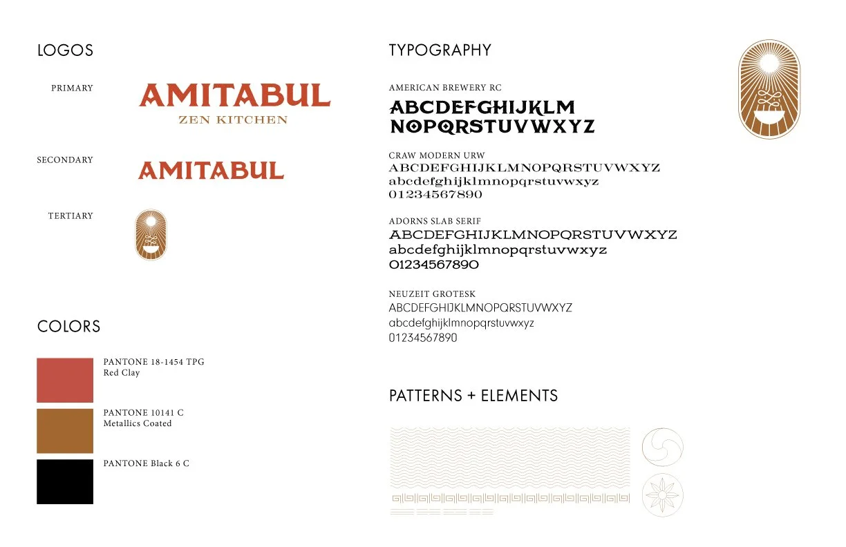
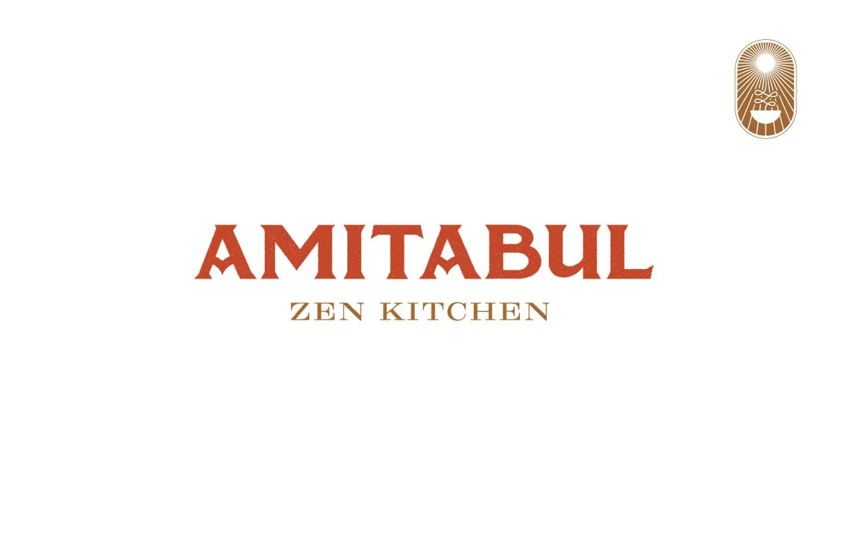
I settled on a primary logo that combined that sense of honor with a steakhouse feeling, and created a tertiary logo as well. Branding was starting to come together.
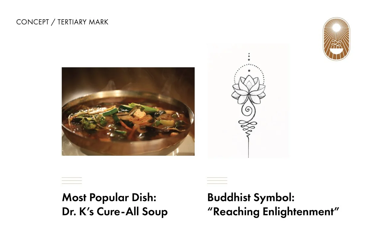
The most popular dish by far at Amitabul is Dr. K’s Cure-All Soup, and the idea of the restaurant is that there is a spiritual significe to food and what you eat— that eating in the right way can benefit you spiritually. Eating in a way to grow spiritually. I started to explore combining these two ideas into a mark.
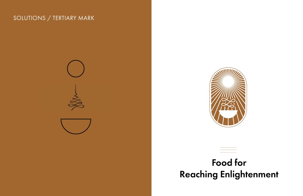
The final mark represented both their most popular dish and the idea of food for reaching enlightenment.
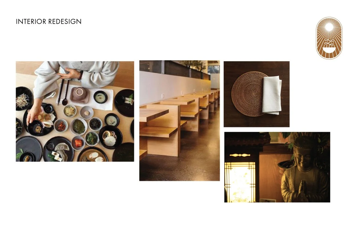
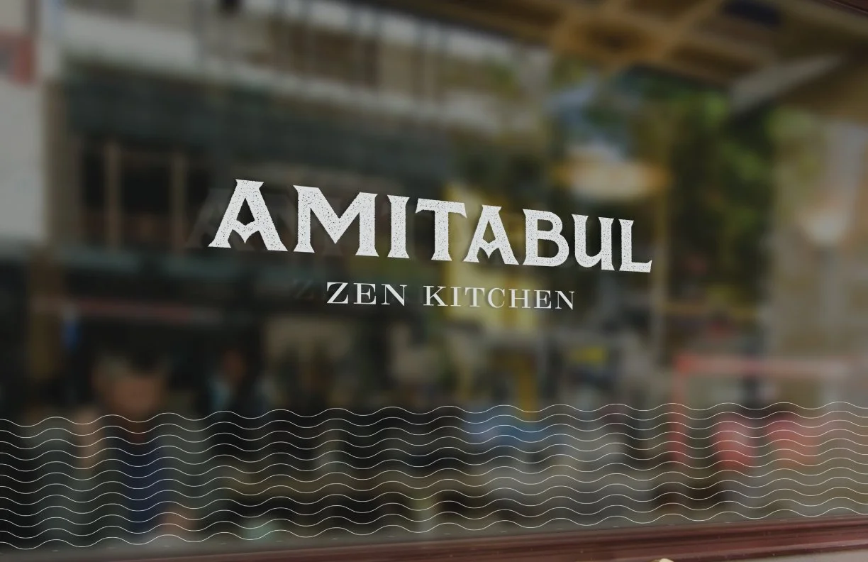
I also conceptualized some changes to the environment to work with the new brand.
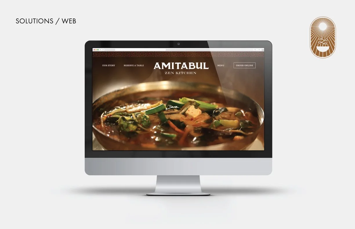
A new website with the branding was also part of this exploration, featuring their most popular dish as a fullscreen hero on the main page.
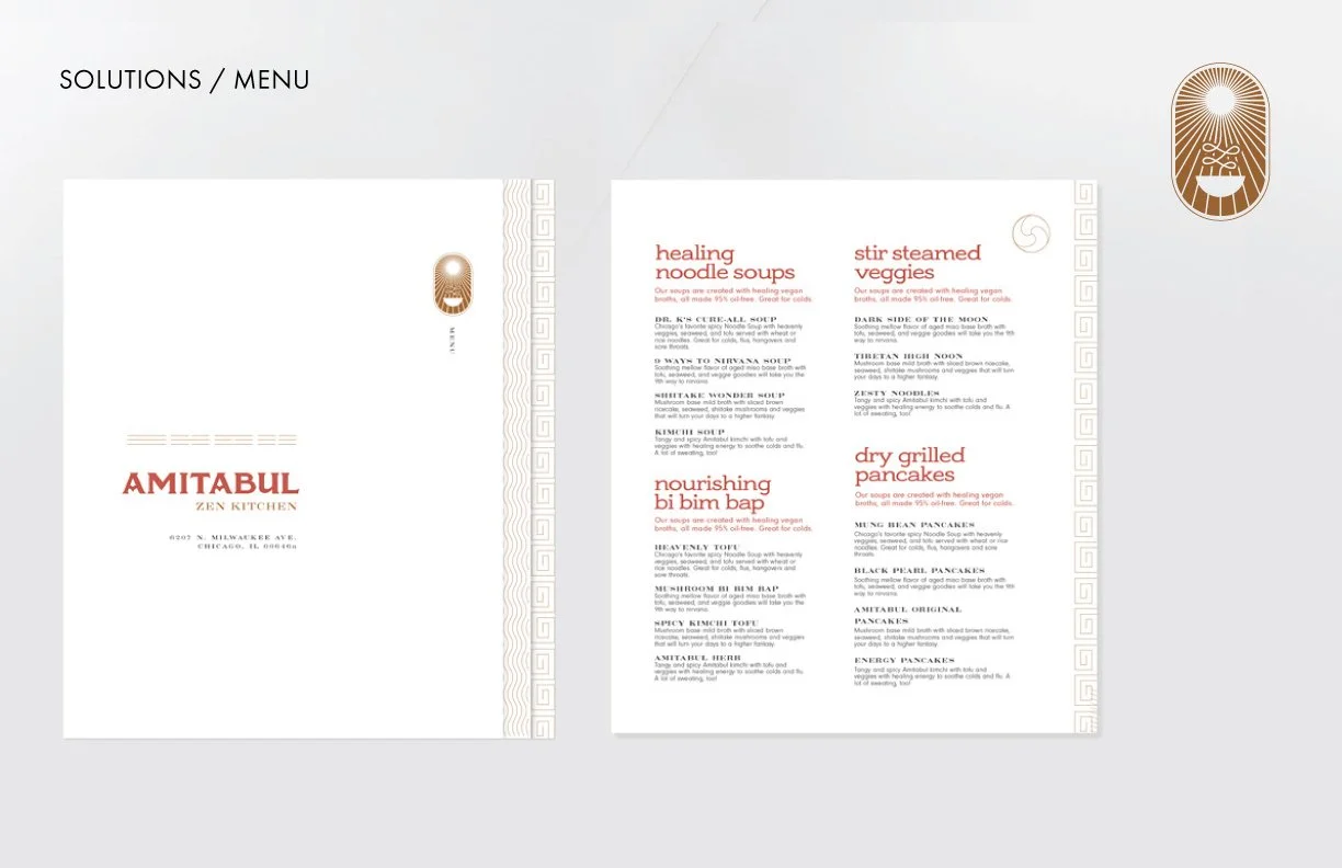
I redesigned the menu to feature their most popular dishes using the new visual language.
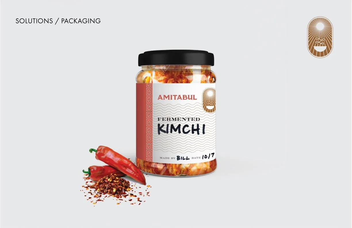
I also created packaging that they could use for famous their fermented sauces, which they are known for, and customers ask to purchase all the time.