
Wildflower Kombucha
PACKAGE DESIGN
A persona-driven kombucha concept inspired by Austin festival culture, psychedelic color, and a shift from nightlife to wellness. The project explores how lifestyle, values, and material choices shape authentic packaging design.
CLIENT
Wildflower Kombucha
INDUSTRY
Food & Beverage
STUDENT WORK
SCOPE
User Persona
Concept Board
Research
Package Design
In a Packaging Design course, we created a customer persona to design a health drink around that would appeal to that person. The goal was to move beyond surface aesthetics and make intentional design decisions rooted in lifestyle, values, and behavior.
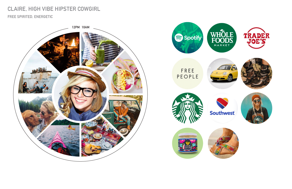
Meet Claire.
She’s an outgoing, festival-going hipster living in Austin, Texas. Claire loves bright colors, music, and social experiences. She’s an ex-whiskey drinker who has transitioned into a high-vibe, vegan, health-conscious lifestyle. Kombucha fits naturally into her daily rituals.
To better understand her, I created a persona map that explored:
A typical day in her life
Her favorite brands and places to shop
What she values socially, aesthetically, and ethically
How health and self-expression show up in her identity
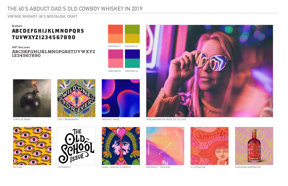
Concept Board
With Claire’s personality in mind, I created a concept board inspired by:
Festival culture
Psychedelic and hippie aesthetics
Bright, expressive color palettes
A vintage, old-school typographic feel
Category Research
I did an initial packaging audit in the Kombucha category to see what else existed in the space and how I might define a niche for this product.

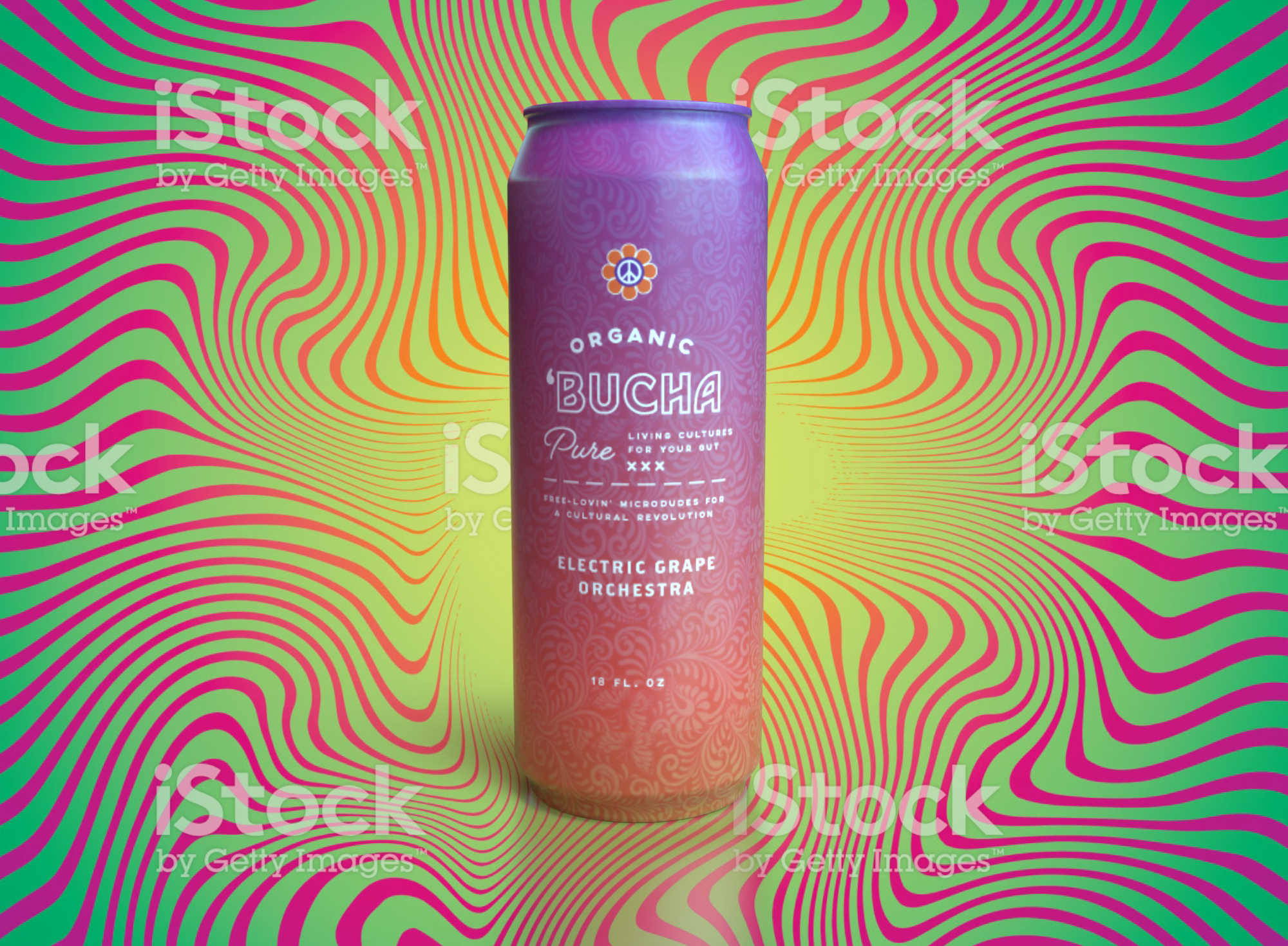
Early Exploration
I quickly mocked up several early design directions to test ideas. While the typography was fun and expressive, the initial designs felt flat and lacked visual depth.
Using what worked, I pushed the gradient system and layout further, experimenting with structure while trying to preserve the energy of the original concept.
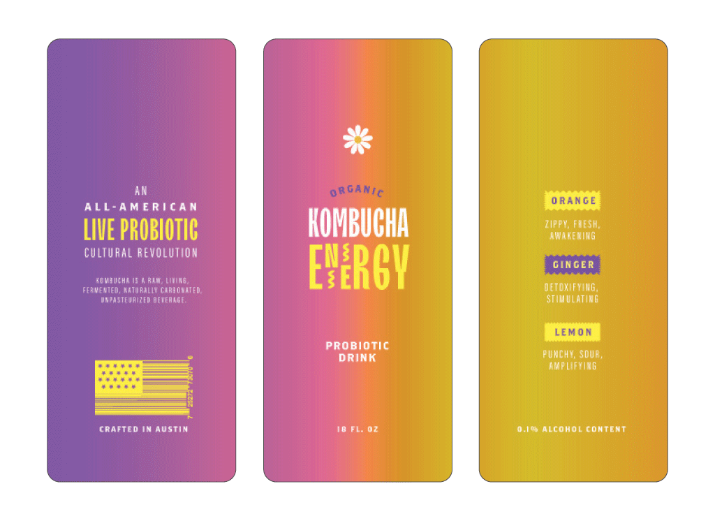
Concept Development & Refinement
I expanded the design into three flavor variations, refining color, hierarchy, and visual rhythm. Typography became the biggest challenge — the colors and treatments weren’t quite landing.
Returning to an early mood board collage I did pre-project, I pulled inspiration from a typographic reference which helped unlock a more expressive and dimensional typographic direction.
At this stage, I also tested the designs on aluminum cans using Dimension. Visually, they improved — but something still felt off.
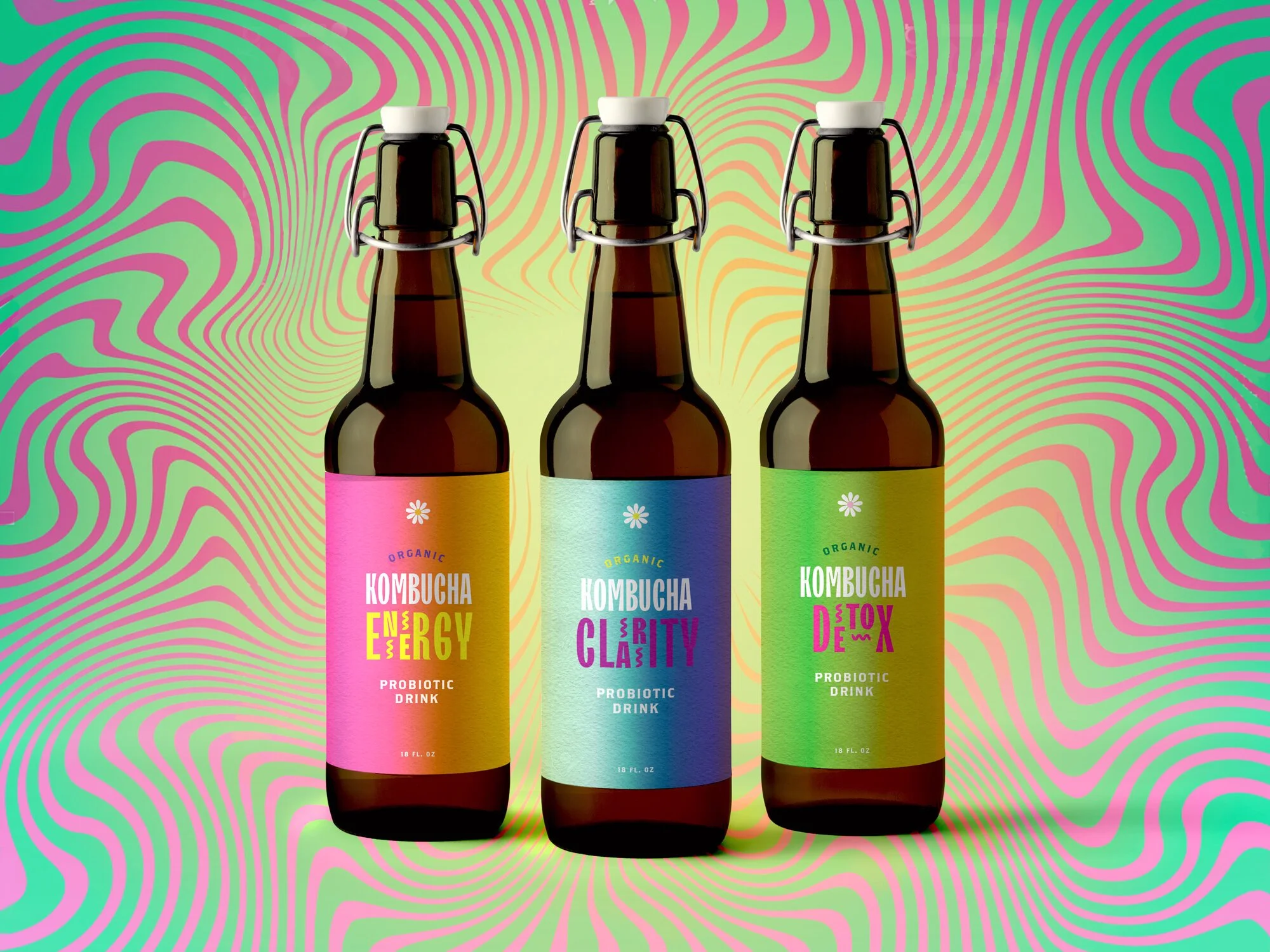
Strategic Shift: From Can to Glass
Re-evaluating both the user and the product, a key insight emerged:
Acidic kombucha + aluminum cans = potential heavy metal leaching
Claire values health, sustainability, and authenticity
Glass bottles align better with vintage aesthetics and health-forward branding
Although cans were part of the original class requirement, after the course ended I revisited the project and redesigned the final packaging for glass bottles.
This shift resolved both the design flatness and the user mismatch — the concept finally felt complete and honest.

What I Learned
This project confirmed that I thrive in strategy-led design.
By deeply visualizing the user’s life — her routines, values, and aesthetics — I was able to:
Make clearer design decisions
Feel more creatively confident
Create work that felt intentional rather than decorative
I enjoyed this process so much that I’ve since begun integrating customer-persona frameworks into other student projects, even when they weren’t required.
This experience reshaped how I approach design: understanding the human comes first — the visuals follow.