
Amitabul Restaurant
BRANDING
A brand identity redesign for Amitabul, a spiritual vegan restaurant, uniting Eastern symbolism, steakhouse boldness, and handmade integrity into a cohesive visual system.
CLIENT
Amitabul
INDUSTRY
Restaurant
STUDENT WORK
SCOPE
Branding
Project Overview
Amitabul is a spiritual vegan restaurant founded by Bill, whose background spans both steakhouse kitchens and Buddhist temple cooking. The restaurant reflects this unlikely intersection — bold yet contemplative, hearty yet plant-based — rooted in integrity, responsibility, and handmade, slow food practices.
This project explored a full identity rebrand to bring consistency, clarity, and symbolic depth to the Amitabul experience.
The Challenge
Through research into Amitabul’s history and ethos, I defined the brand’s core values as:
Integrity
Responsibility
Slow, intentional food
Spiritual nourishment
Healthy vegan cuisine
However, the visual identity lacked cohesion. The storefront used one logo, while the menu and website used another. There was no unified visual language tying the brand together.
The goal was to create an identity that:
Honored its Eastern spiritual roots
Reflected the boldness of Bill’s steakhouse background
Felt grounded and handmade
Brought visual consistency across all touchpoints
Research & Concept Development
While exploring visual narrative directions, I studied several culturally relevant symbols connected to Korean heritage and Buddhist tradition:
The structured line work of the Korean flag
The Danch’eong flower symbolizing enlightenment
The Buddhist swastika as a symbol of universal energy and power
The Taegeuk representing balance and equality
These symbols reflected both Bill’s background and the spiritual philosophy embedded in the restaurant’s food.
Rather than using them literally, I simplified and abstracted their forms into a refined visual language — distilling meaning without overwhelming the brand.
Iteration & Visual Language
The early design phase involved extensive hand-drawn explorations. I tested how to combine:
The honor and structure of temple symbolism
The boldness and presence of a steakhouse
The clarity and simplicity expected in modern vegan branding
Through iteration, I developed:
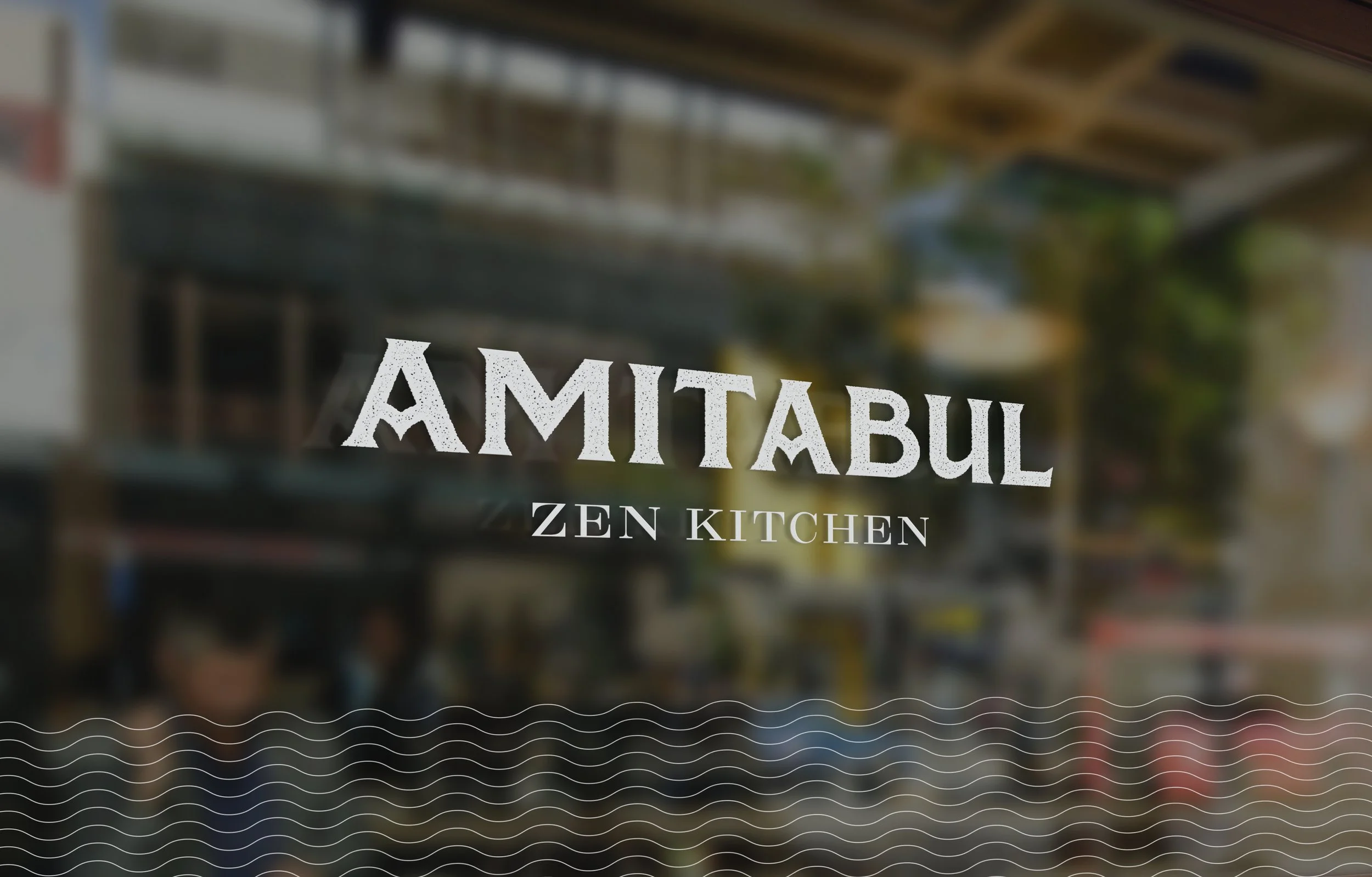
A primary logo balancing strength and reverence
A tertiary mark for flexible brand applications
A system of shapes and line work derived from the symbolic research
The identity began to unify around a visual rhythm that felt both grounded and elevated.
Conceptual Anchor: Dr. K’s Cure-All Soup
Amitabul’s most popular dish is Dr. K’s Cure-All Soup, a dish that reflects the restaurant’s deeper philosophy: that food can nourish not only the body, but the spirit.
The restaurant’s guiding belief is that eating intentionally supports spiritual growth — that food can be a vehicle for enlightenment.
I explored combining:
The symbolism of enlightenment
The circular, communal form of a bowl of soup
The idea of nourishment as spiritual medicine
The final mark embodies both the iconic soup and the concept of food as a path toward balance and awakening.
Solution
The rebrand extended across multiple applications to create a cohesive system:
Visual Identity
Primary and tertiary logo marks
Simplified symbolic forms integrated into a unified visual language
Environmental Concepting
Proposed updates to the physical restaurant space to better align with the refined identity.
Website Redesign
A new website concept featuring Dr. K’s Cure-All Soup as a fullscreen hero image — positioning the dish as both product and philosophy.
Menu Redesign
Menus were restructured to highlight popular dishes using the new branding system and consistent typography.
Packaging Design
I created packaging concepts for Amitabul’s well-loved fermented sauces — products customers frequently request to purchase — expanding the brand into retail-ready goods.